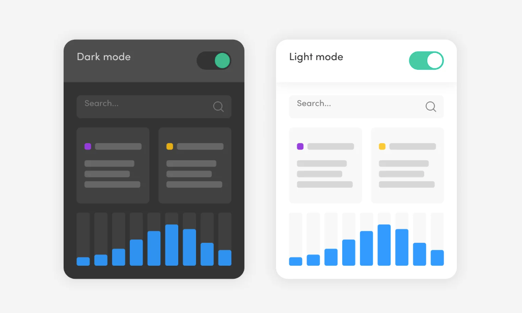
Dark mode UI typically features a darker color palette, primarily consisting of shades of gray or black. Here’s a basic breakdown of the design elements for a dark mode user interface:
- Background: Dark tones like #121212 or #1e1e1e.
- Text: Light colors such as white (#ffffff) or light gray (#b0b0b0) to provide high contrast against the dark background.
- Accents: Bright colors (e.g., blue, green, orange) for highlights, buttons, or icons to stand out clearly.
- Shadows: Subtle shadows to create depth without overpowering the minimalism of dark mode.
- Borders: Lighter borders can be used to delineate areas if shadows are too subtle.
This design reduces eye strain in low-light environments and helps conserve battery on OLED screens.
Are you planning to come to the dark side and add a dark mode to your design? The buzz around night themes seems to get only louder each year. Let`s talk about it relying on the experience of our web development team.
What is the dark mode?
Dark mode (also called night mode or lights-out mode) is a type of user interface with an altered color scheme. Such contrast may resemble a negative in photography. It has dark background colors and light foreground, light text and elements on a darker background.
Its popularity rose in 2018 after the release of dark mode on macOS Mojave. Although it’s being talked about a lot recently, it is not a new idea at all. In fact, dark themes are what website design started from. As you might remember, the monitors in the 80s were of the “green-on-black” type, but only because the luminescent coating inside emitted a greenish glow. But even after the invention of color monitors, dark mode is still in use.
Whether it is a mobile device, desktop application or even a smart TV, you can find the dark mode option here too. Large companies such as Google and Apple have already incorporated it into their interfaces. Nor can we forget about social networks such as Twitter or YouTube.
Benefits of dark UI
Why is dark mode so popular and some even consider it essential in every app? Here are the five key reasons why so many people love it.
- Following the trend
- It keeps eyes more comfortable
- It saves battery life
- It gives more choice
- It provides your brand with a new identity
Tips for creating a dark theme
- Avoid pure black
- Avoid pure white fonts
- Be careful with saturated colors on dark themes
- Use brand colors wisely
- Don’t lose your brand’s personality
- Never use shadows
- Communicate depth
- Meet accessibility color contrast standards
- Review your imagery database
- Allow users to switch from regular to the dark mode
- Test your solutions with end-users


